
A chart pattern is a shape inside a price chart that can help predict what a price will do next, based on what they have done previously. Chart patterns are the foundation of technical analysis, and they necessitate a trader's understanding of both what they are looking at and what they are searching for.
There are numerous chart patterns, and you might be familiar with a few of them as a trader. These chart patterns are significant when it comes to technical analysis.
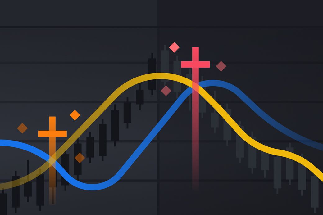
In today's post, we will discuss what Golden Cross & Death Cross, how they form, how they can be used, and many more.
What is a Golden Cross?
According to Binance Academy, Golden Cross is a chart pattern that involves a short-term moving average crossing above a long-term moving average. This can transpire at any time frame. Still, it is common in 50 days moving average and 200 days moving average.
The golden cross may be used in currencies, commodities, stocks, indexes, and exchange-traded funds.
Sometimes a golden cross can be seen as a positive indicator in various situations, which is because the concept is straightforward. We know that a moving average calculates the average price of an item over a given time. A short-term moving average drop below a long-term moving average indicates that the short-term price movement is bearish compared to the long-term price action.
Stages of a Golden Cross?
There are three precise stages of a Golden Cross. The first stage is where a downtrend ends as selling is depleted.
The second stage involves the formation of a new uptrend. When the short-term average crosses from below to above the long-term average, it forms the Golden Cross, signalling the start of a new uptrend.
The third stage is the continuation of the uptrend in anticipation of rising pricing. On pullbacks, the moving averages function as support levels until they cross back down, at which time a death cross may emerge.
What is a death cross?
A death cross is the reverse of a golden cross. It is a chart pattern in which a short-term moving average crosses below a long-term moving average. For example, the 50-day moving average crosses below the 200-day moving average. As a result, a death cross is generally seen as a bearish indicator.
When a Death Cross occurs, the higher period Moving Average becomes a new resistance level in the next bearish market. Assuming the 5-day MA falls below the 15-day MA. When the price drops, the 15-day MA line will become the new barrier.
Stages of a Death Cross?
The formation of the Death Cross comprises three major stages. The first stage involves security existing on an uptrend when it reaches its maximum as purchasing momentum weakens. The price then begins to decline as sellers gain a competitive advantage in the market.
The second stage is a drop in the security's price to the point where the 50-day moving average falls below the 200-day moving average, resulting in the actual death cross. This downward move in the 50-day moving average indicates the beginning of a new, negative long-term market trend.
The third stage is the continuation of the market's downward trend. The new downtrend must be maintained for an actual death cross to be recognised. If the downward momentum is just temporary and the market returns to the upside, the cross of death is deemed a false warning.
In conclusion, A golden cross occurs when a short-term moving average crosses over a long-term moving average. A death cross occurs when a short-term MA crosses beneath a long-term MA. They may both be used as trusted tools for verifying long-term trend reversals in the stock market, forex, or cryptocurrency.
Subscribe to Plezna
Crypto knowledge delivered, right to your inbox